
2013 · Identity & website
A familiar name. A clear direction.
An identity and website for a driving academy, with a mark that puts the road at the heart of the name.
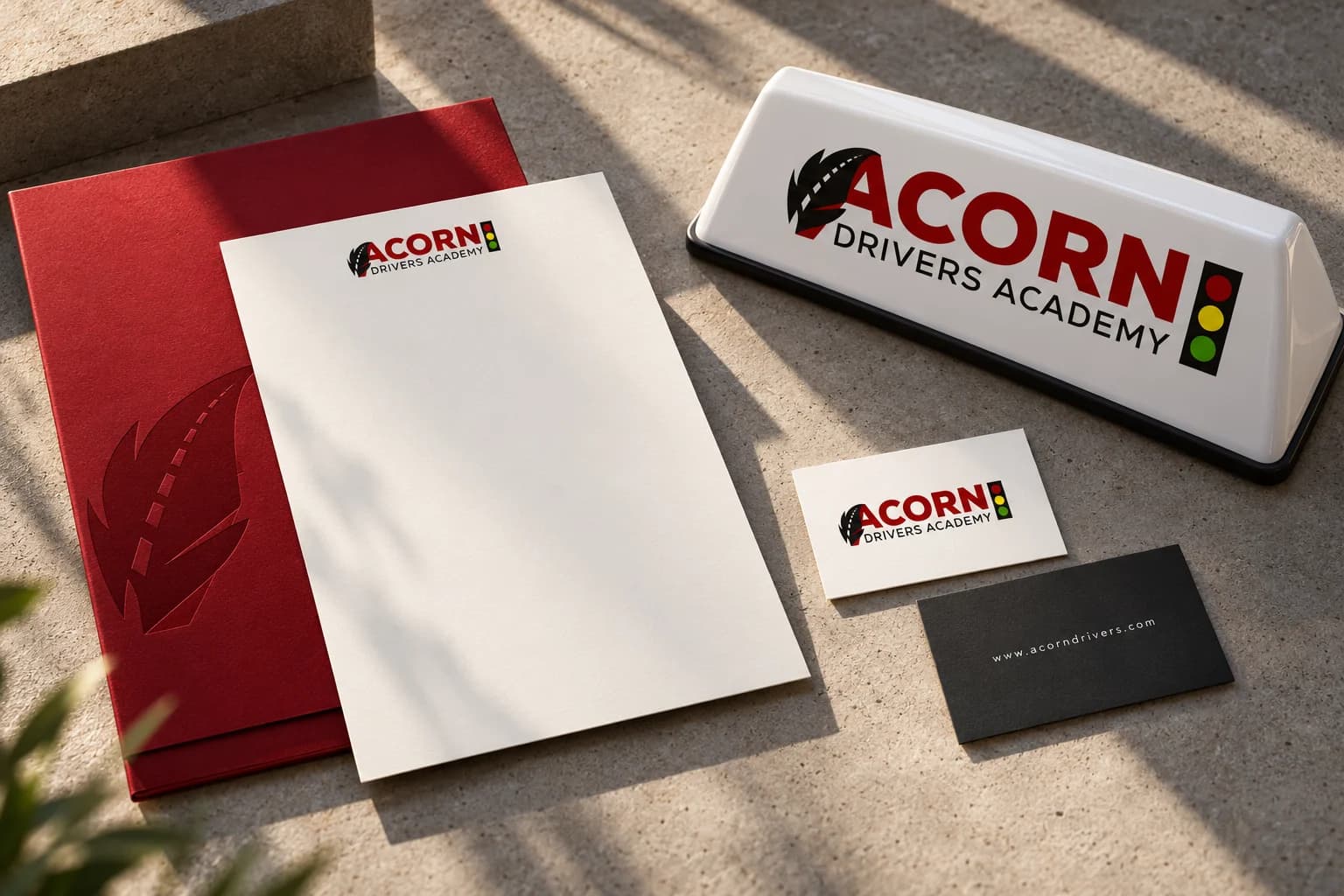
Acorn Drivers / The brief
A driving academy with a name worth remembering.
Our earlier work for Acorn Drivers included its logo and website. The surviving 2013 files give us a closer look at the identity: the leaf-shaped road, the traffic signal and the ways the signature was adapted for different formats.
The signature
A road runs through it.
The original 2013 artwork brings a leaf, a lane marking and a traffic signal into one recognizable signature.
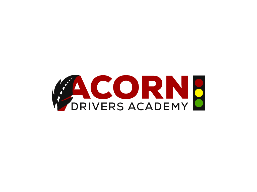
Leaf → road → recognition.
The white dashed line gives the leaf a second meaning. The traffic signal completes the reference to learning to drive.
From the original files / 2013
The archive behind the story.
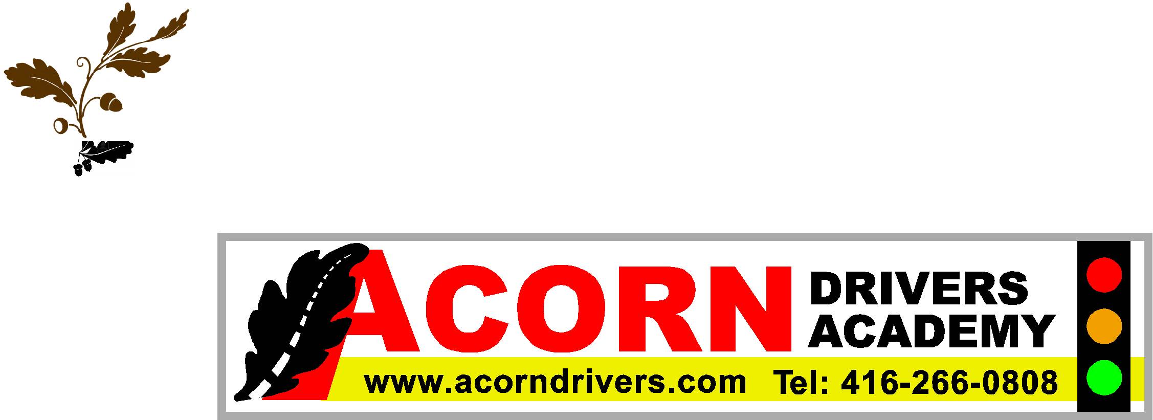
The sign artwork adapts the compact logo into a wide format. The archive also contains business-card source artwork and letterhead templates.
An earlier chapter / 2013
Good work deserves a second look.
The original logo and website belong to our earlier client work. This retrospective preserves the original mark and gives it a fresh presentation, with a clear distinction between surviving artwork and new application concepts.
What the work brings together
A recognizable identity that connects the Acorn name directly to learning to drive.
Visit Acorn Drivers ↗Your next project